Talabat Pro — fixing silent charges and invisible credit
Redesigning subscription transparency for a live delivery platform — unsolicited, solo.
UI | UX
Product Design
Redesign
Project Overview
Client
Talabat (concept redesign, unsolicited)
Timeline
1 week, self-initiated
Role
Product & UX Designer — solo
Tools
Figma, Gemini
The problem
Talabat Pro is a paid subscription that promises free delivery and member-only discounts. On a live account I hit two quiet failures that steadily eroded trust. First, a silent renewal: the plan charged again with no clear heads-up, so the deduction felt like it came out of nowhere. Second, invisible credit: refunds and promo credit existed somewhere in the system, but the app never surfaced them at the moments they mattered — the home screen and checkout.
Neither problem is a bug. Both are transparency gaps — the product technically works, but it never tells the user what is about to happen or what they already have. That is a design problem, and it is fixable without touching the billing backend.
My Role
This was entirely self-initiated — no brief, no client, no team. I noticed the problem as a real Talabat Pro subscriber and decided to fix it end to end: framing the transparency gaps, gathering evidence from my own account and public reviews, designing the flows, and producing before/after comparisons against the current shipped app.
Every decision here is mine, from the problem definition through the final screens. The goal was narrow and honest: make charges expected and make credit visible.
Research & Discovery
The evidence
A Google Play review from June 2026 describes the Pro plan being added the moment a mistap happened — "charged me and added the plan instantly," no confirmation step, no automatic refund.
Trustpilot reviewers report free trials converting to paid with no findable auto-renewal toggle — and in one case, enrolment in Family Pro without consent.
Talabat's own terms do the quiet part in writing: Pro auto-renews every 30 days, and you must cancel at least 24 hours before the date or the charge lands. The app never surfaces that deadline.
On my own account, wallet credit never surfaced on the home screen or at checkout — it lived only inside a buried wallet page.
Process
I scoped three fixes, each targeting one silent moment. The rule I set myself: no new screens where an existing one already had the user’s attention. Every change had to live on a surface the user was already looking at — the subscribe overlay, the notification tray, the home screen, and checkout.
01 — Subscribe flow
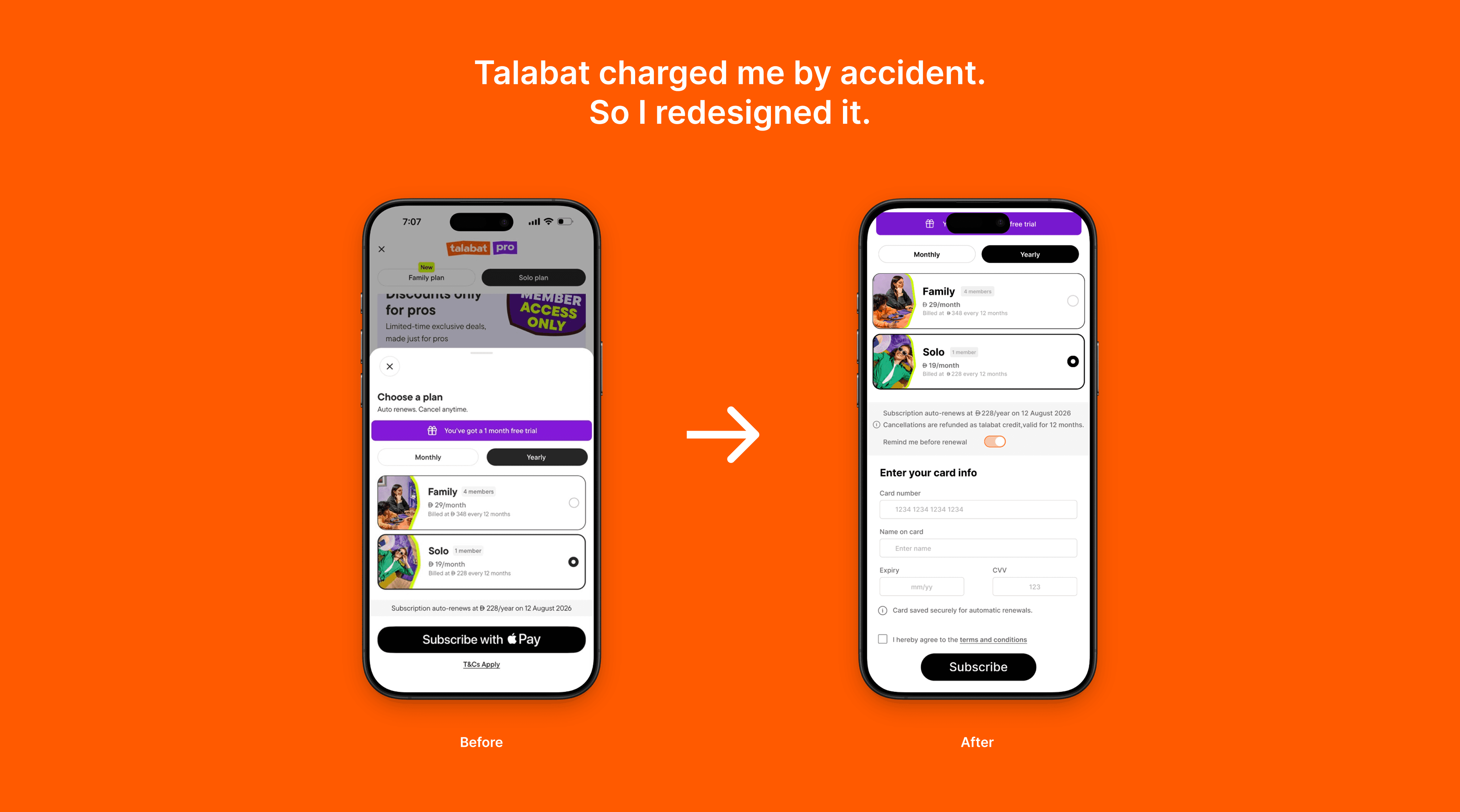
The current subscribe overlay sells the perks but hides the commitment: it shows the date but buries the cancellation terms and offers no reminder My redesign pins the price, the renewal date, and a plain-language “you can cancel anytime before [date]” line directly above the confirm button — the decision and its consequence in the same glance.
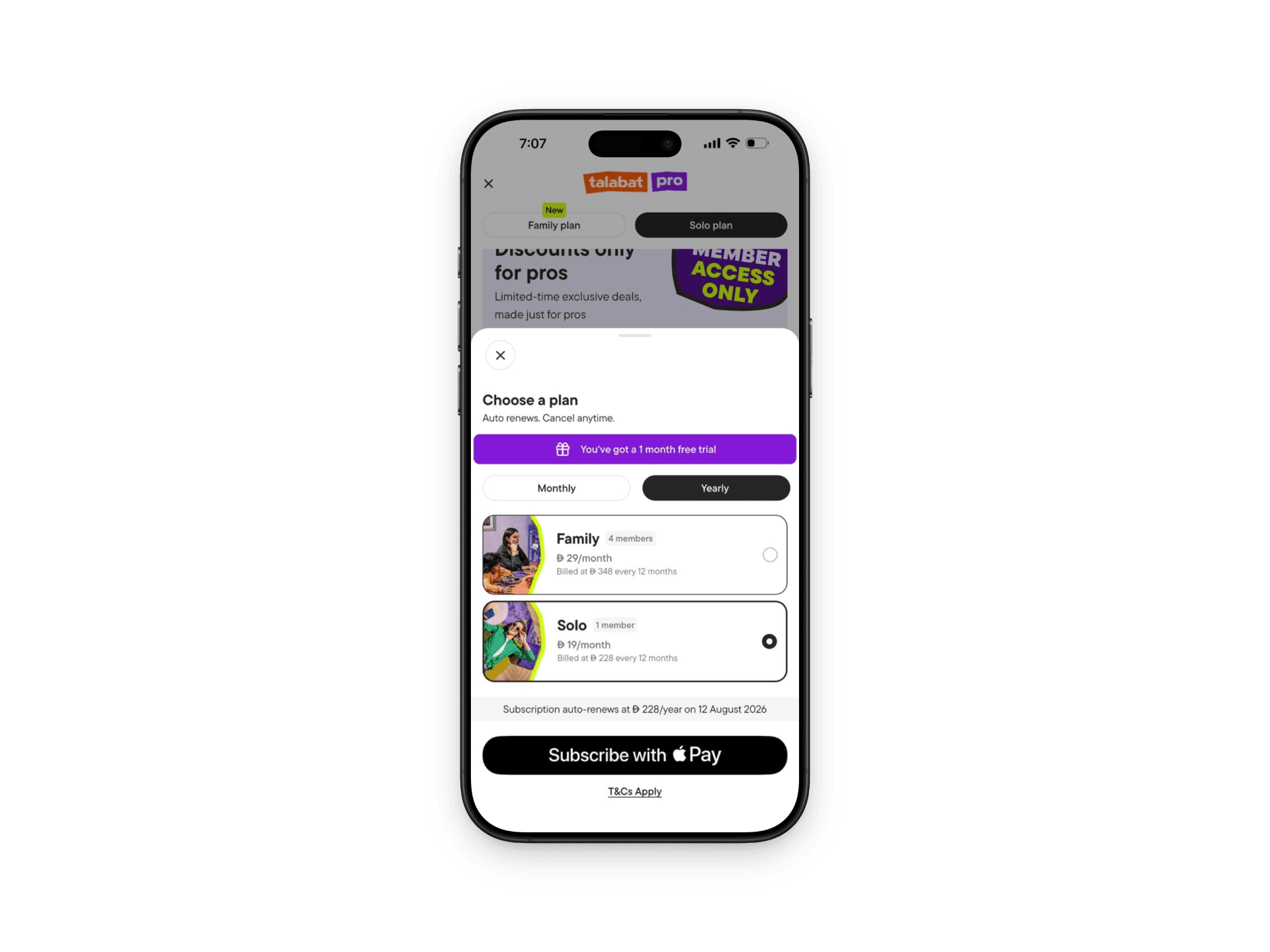
Current subscribe overlay

Redesigned overlay

Redesigned subscribe flow — full view
02 — Renewal reminder
A silent charge is only silent because nothing warned you. I added a pre-renewal push notification and matching in-app banner that fires 24 hours before the charge — stating the amount, the date, and a one-tap path to manage or cancel. It turns the deduction from a surprise into a confirmation.

New — fires 24 hours before renewal
03 — Invisible credit banner
Wallet credit was real but buried. I surfaced it as a dismissible banner in the two places spending decisions happen: the home screen (“Đ 25 credit expires in 6 days.”) and the checkout total, surfaces a one-tap Claim at the total. The money the user already owns finally shows up when it can change a choice.

Home — current
Before — credit hidden

Home — with credit banner
After — credit surfaced

Before — no credit applied

After — credit available to claim

After — credit claimed at total
Final design
The full set of redesigned screens, side by side. Every change stays inside Talabat’s existing visual language — the goal was transparency, not a re-skin.
Renewal notification
Home with credit banner

Checkout with credit applied
Outcome
Because this is a concept, the outcome is measured in argument quality rather than shipped metrics. Each fix is defensible: it targets a documented complaint, lives on a screen the user already sees, and requires no billing-system change — only surfacing information the platform already holds.
If shipped, the hypotheses are clear — fewer “charged without warning” reviews, fewer accidental renewals, and higher use of existing wallet credit. All three are trackable with events the app can already emit.
Reflection
The hardest discipline here was restraint. It is tempting to redesign the whole subscription; the honest fix was smaller and sharper — say the quiet part out loud, at the right moment, on the right screen. Transparency is rarely a new feature. Usually it is information the product already has, shown one step earlier.
I would still love to validate the credit banner with real users and pressure-test the notification timing. But the case stands on its own: trust in a paid subscription is built in the seconds before a charge, and that is exactly where Talabat Pro was staying silent.