The problem
Jeebly's delivery riders had no centralised tool to manage their day-to-day work life. Leave requests were scattered, pay slips were inaccessible, training had no home, and there was no way to flag issues or feel recognised for their work. The app didn't exist — only a rough internal idea did.
The challenge was to take that idea, shape it into a real product, and ship it — while the main consumer app was simultaneously in active development and taking priority.
My Role
I was the sole designer on this project, assigned by the Associate Product Manager. I owned everything from early low-fidelity concepts through to the final Figma handoff — including contributing to feature decisions, flagging UX concerns, and pushing for design choices that served the rider's real environment.
Research & Discovery
There was no formal user research phase — the timeline didn't allow for it. Instead, the feature set was shaped collaboratively: the team gathered operational pain points from internal stakeholders, reviewed what riders were requesting, and cross-referenced with similar apps like Keeta and Talabat's rider-facing tools to understand existing patterns and expectations.
The feature list went through the broader team and leadership before being narrowed down to what shipped.
One key insight I brought early: riders use this app outdoors, often in bright sunlight, sometimes in a rush. That shaped a core decision — bolder typography throughout, so critical information is readable at a glance without squinting or stopping.
Process
I started directly in Figma with low-fidelity frames, only moving to rough sketches when brainstorming specific flows. This kept iteration fast given the tight deadline.
Key constraints from the brief:
UX correctness was the priority — not heavy visual design
Subtle branding, not decorative UI
No complex animations
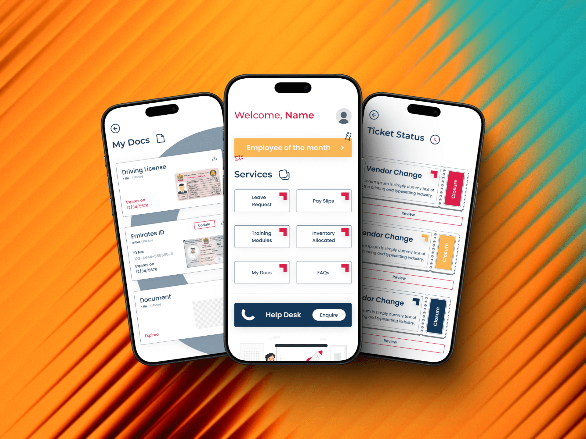
The feature set included: Employee of the Month recognition, leave requests, pay slip access, training modules, inventory tracking, document management, an FAQ section, and an integrated help desk.
The designs went through approximately 5 rounds of revision. One notable pushback: I had explored richer prototyping to communicate interactions, but the team refocused me on function over form — a fair call given the product stage and timeline.
Process
I started directly in Figma with low-fidelity frames, only moving to rough sketches when brainstorming specific flows. This kept iteration fast given the tight deadline.
Key constraints from the brief:
UX correctness was the priority — not heavy visual design
Subtle branding, not decorative UI
No complex animations
The feature set included: Employee of the Month recognition, leave requests, pay slip access, training modules, inventory tracking, document management, an FAQ section, and an integrated help desk.
The designs went through approximately 5 rounds of revision. One notable pushback: I had explored richer prototyping to communicate interactions, but the team refocused me on function over form — a fair call given the product stage and timeline.
Process
I started directly in Figma with low-fidelity frames, only moving to rough sketches when brainstorming specific flows. This kept iteration fast given the tight deadline.
Key constraints from the brief:
UX correctness was the priority — not heavy visual design
Subtle branding, not decorative UI
No complex animations
The feature set included: Employee of the Month recognition, leave requests, pay slip access, training modules, inventory tracking, document management, an FAQ section, and an integrated help desk.
The designs went through approximately 5 rounds of revision. One notable pushback: I had explored richer prototyping to communicate interactions, but the team refocused me on function over form — a fair call given the product stage and timeline.
Design Decisions
Typography first. Larger, bolder type wasn't a stylistic choice — it was a usability call for an outdoor, on-the-go context.
Subtle branding over decoration. Rather than stripping the app of personality, I wove Jeebly's brand identity into small moments throughout the UI — colour accents, iconography touches — enough to feel cohesive without distracting from the task at hand. This ended up being one of the most positively received elements of the final design.
Simplicity over completeness. With riders as the user, every screen had to be immediately scannable. No deep navigation, no cognitive load.
Design Decisions
Typography first. Larger, bolder type wasn't a stylistic choice — it was a usability call for an outdoor, on-the-go context.
Subtle branding over decoration. Rather than stripping the app of personality, I wove Jeebly's brand identity into small moments throughout the UI — colour accents, iconography touches — enough to feel cohesive without distracting from the task at hand. This ended up being one of the most positively received elements of the final design.
Simplicity over completeness. With riders as the user, every screen had to be immediately scannable. No deep navigation, no cognitive load.
Design Decisions
Typography first. Larger, bolder type wasn't a stylistic choice — it was a usability call for an outdoor, on-the-go context.
Subtle branding over decoration. Rather than stripping the app of personality, I wove Jeebly's brand identity into small moments throughout the UI — colour accents, iconography touches — enough to feel cohesive without distracting from the task at hand. This ended up being one of the most positively received elements of the final design.
Simplicity over completeness. With riders as the user, every screen had to be immediately scannable. No deep navigation, no cognitive load.
Outcome
The design was completed and handed off before my internship ended. The main JNoW consumer app was in active development at the same time — this project ran in parallel and still hit its deadline.
The feedback was positive, particularly around the subtle brand consistency threaded through the app. Stakeholders appreciated that it felt like a Jeebly product without being over-designed.
Alongside both apps, I also restructured Jeebly's entire internal knowledge base — rewriting and reformatting Q&As and designing the layout — all within the same internship period.
Outcome
The design was completed and handed off before my internship ended. The main JNoW consumer app was in active development at the same time — this project ran in parallel and still hit its deadline.
The feedback was positive, particularly around the subtle brand consistency threaded through the app. Stakeholders appreciated that it felt like a Jeebly product without being over-designed.
Alongside both apps, I also restructured Jeebly's entire internal knowledge base — rewriting and reformatting Q&As and designing the layout — all within the same internship period.
Outcome
The design was completed and handed off before my internship ended. The main JNoW consumer app was in active development at the same time — this project ran in parallel and still hit its deadline.
The feedback was positive, particularly around the subtle brand consistency threaded through the app. Stakeholders appreciated that it felt like a Jeebly product without being over-designed.
Alongside both apps, I also restructured Jeebly's entire internal knowledge base — rewriting and reformatting Q&As and designing the layout — all within the same internship period.